The Barn Board 
Store.
Project Type
Freelance
Branding
Contributors
Designer:
Cody LaFond
My Contribution
Creative Direction
Logo Design
Visual Identity
Stop in, woodn't you?
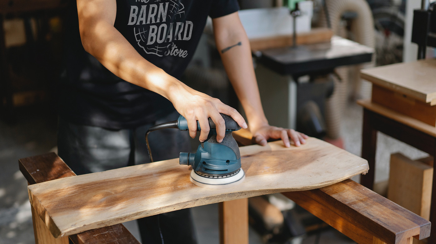
The Barn Board Store is a high-end materials supplier and furniture retailer who specializes in barn board, reclaimed wood, live edge slabs, custom furniture construction and wood supplies. An industry leader, their work has been featured on local TV networks such as HGTV, W Network and City Line TV. Their full service fabrication shop caters to residential and commercial projects alike and are capable of manufacturing just about anything you can dream up — so long as quality wood is involved.

When this project first came about the client’s marketing was quite bare. A modest social media following, a basic website and logo, certainly nothing too extravagant. After all, these folks are in the shop getting their hands dirty day in and day out making beautiful wooden creations. They’re a dutiful team, but a small one, and I suspected they did not have a graphic designer on staff. They rolled with what they knew and what worked for them up until that point. However, it was time to level up.

Despite their notoriety, they are a smaller company with only two locations. They foster close relationships with their customers to produce truly one of a kind custom pieces, and as such, it was important that their brand adequately portray who they are and how they conduct business. They were to be positioned as a boutique shop but without a sense of exclusivity, and their identity was to appear just as the pieces they create — modern and classy yet drenched in rusticism.
Barn Board Store dot com.
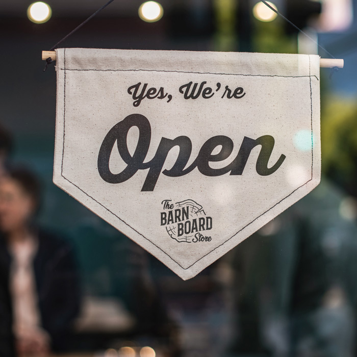
Their previous logo and identity (or lack thereof) felt to me like a remnant of the 90s dot com boom. They were quite literally branded as “barnboardstore.com”. While their business originated through their adoption of online sales and later their grass roots social media presence, on this side of the millennium it is assumed any business has a functional website, which left the “.com” moniker feeling just a little dated. It was dropped for a much tidier and succinct “The Barn Board Store”. Being primarily a brick and mortar store-front driven business, the change was a welcomed one that more closely paralleled their business operations.

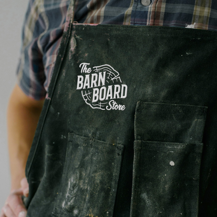
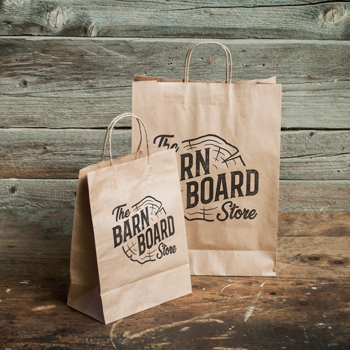
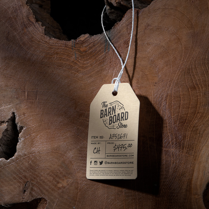
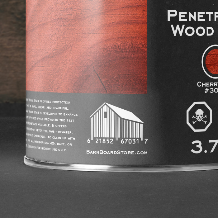
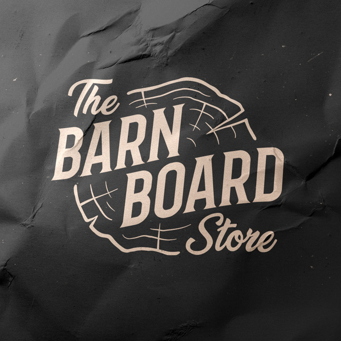
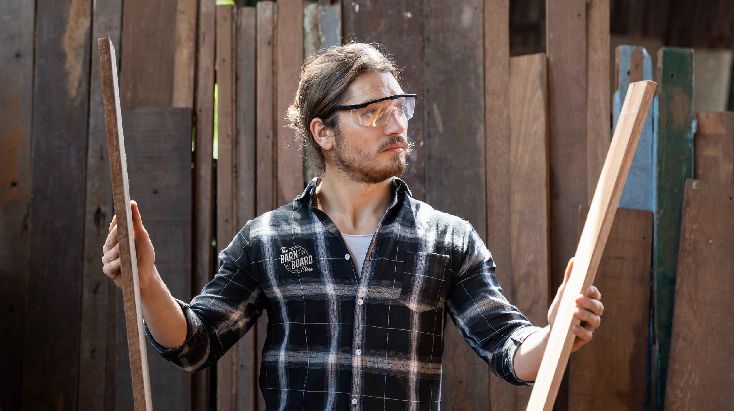
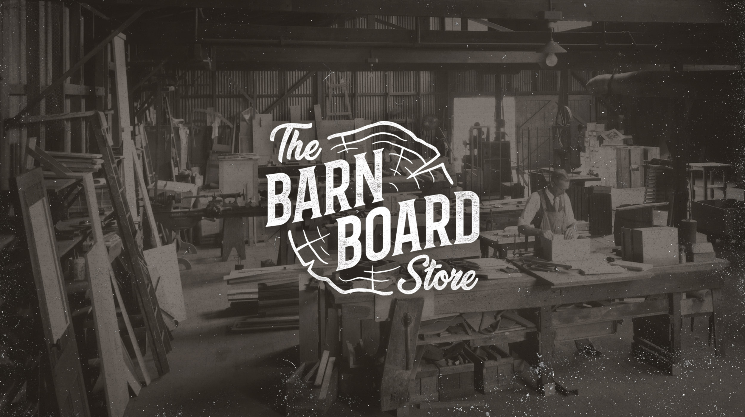
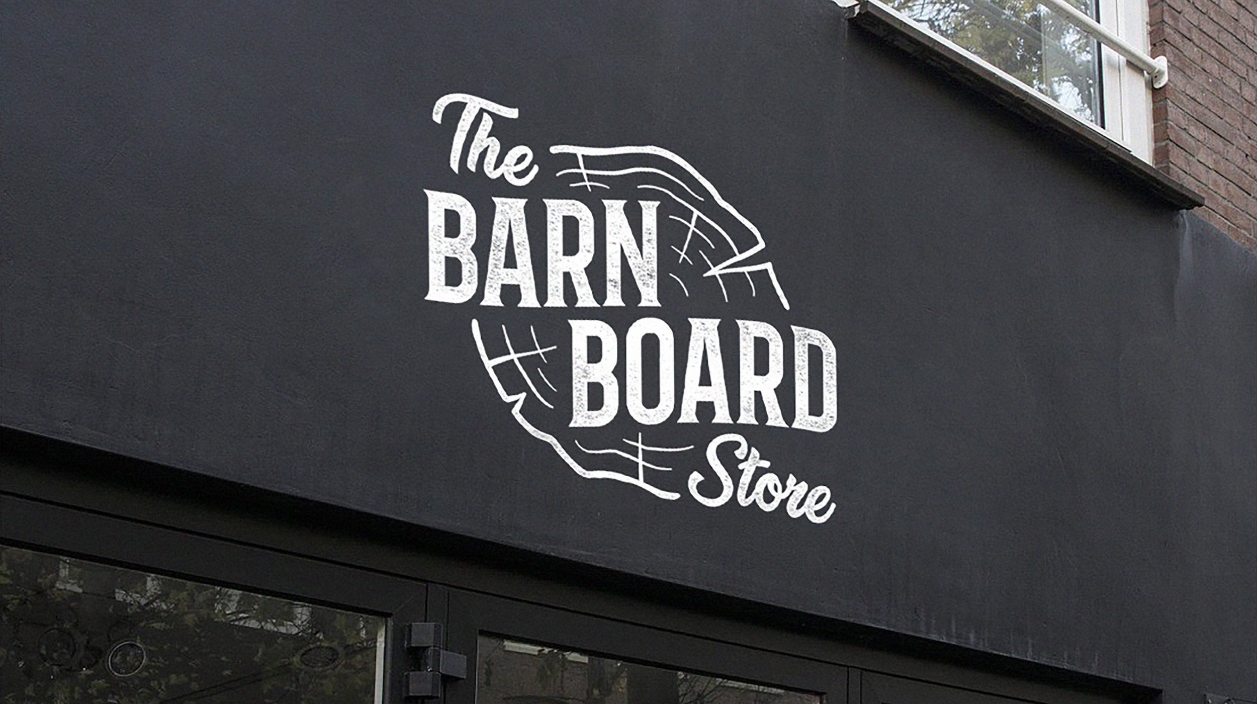
The new logo sports a vintage cowboy-esque logomark set within the cross-section of a tree trunk, with an inviting script serving as a secondary typeface. The visual identity employs generous use of blacks and browns alongside gritty textures one can expect to see in a warehouse or woodshop. The juxtaposition between the elegant muted colour scheme and the natural, organic nature of their wooden wares contributes greatly to achieving the neighborly boutique atmosphere they strive for.

The new mark serves as one behind which the business can thrive, and better market the quality products and craftsmanship they’ve been producing for years.
Livin' on the (live) edge.
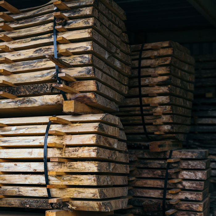
Interestingly enough, not only does The Barn Board Store make high-end items from quality materials, they in fact source a lot of the materials themselves. They often disassemble and reclaim materials from decommissioned barns and structures across Ontario, hence their name. If you peruse their retail space for any amount of time, you’ll likely stumble across a piece of furniture that once served as a barn beam or A-frame for several decades prior to seeing their showroom floor. 

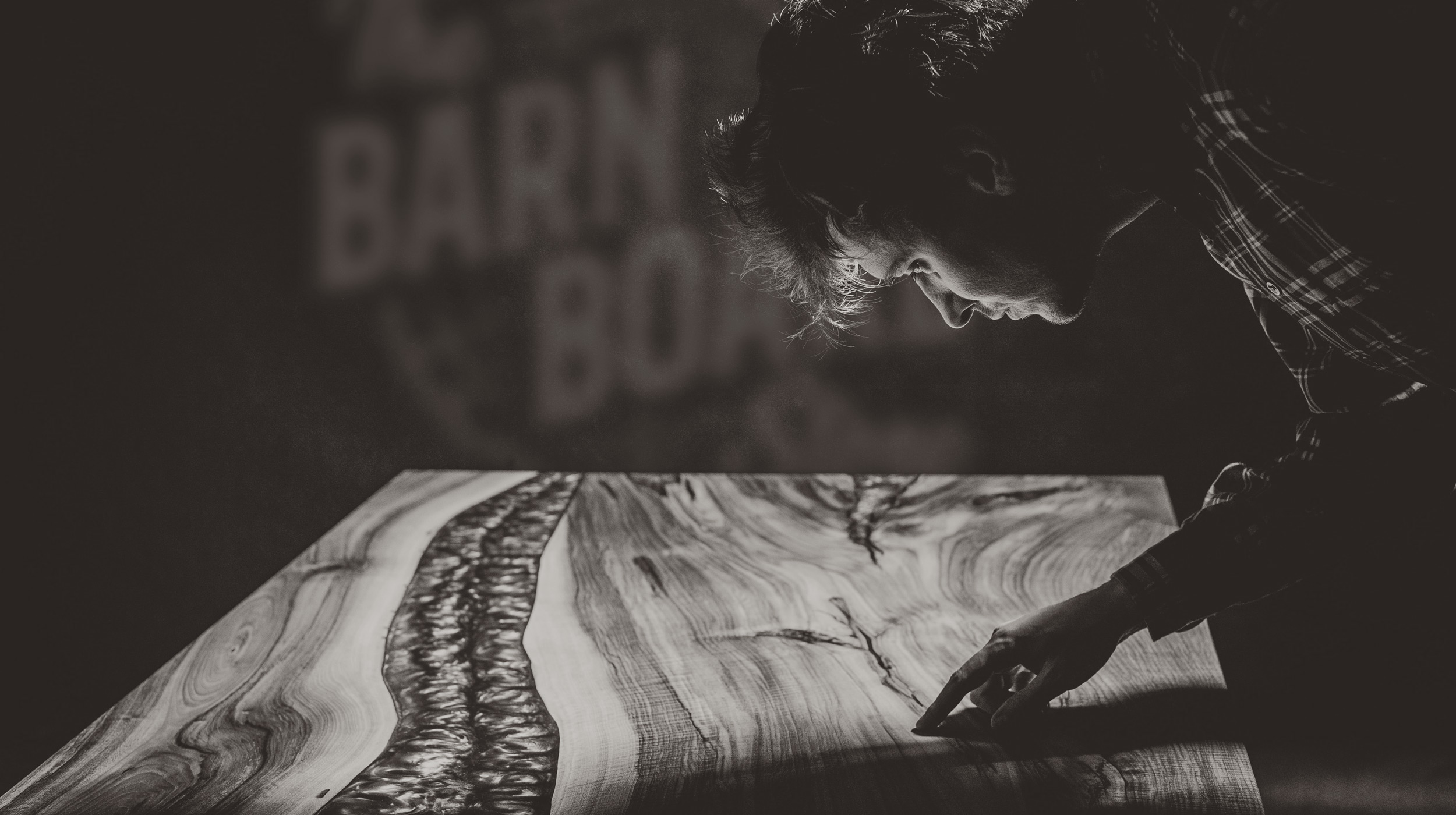
While the reclamation projects are certainly the star of the show (at least in my eyes) that isn’t their sole revenue stream. They also source new materials and mill them into live edge slabs for use as tables, counter tops, wall installations and other high-end furniture. They will also source high quality wood burls and other rare materials upon customer request. When it comes to wood, they truly do it all. 
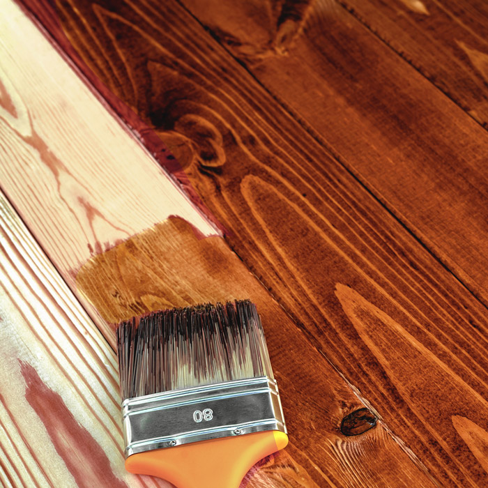
It's all in the finish.
The results of this rebrand were well received across the board and I’m proud to feature this project as a staple in my portfolio. I enjoyed delving into this world of splinters, saws and stains, and relished in the joy of introducing a level of sophistication that the business had surely internalized but never quite communicated outwardly before. 

In the end, and unfortunately, this project never made it beyond the concepts presented here. The work was applauded, and my contacts at the company were very gracious and complimentary in their feedback, but for unknown reasons it was decided that the business would not proceed — and that’s okay. As a designer you learn to roll with the punches and to not take things personally. After all, there are often unforeseen variables outside your control. Sometimes things just don’t fall into place as you expect them to.

With that said, the project was a great experience and I had a blast learning all about the industry. Perhaps some day they will circle back around and reach out, but for now a portfolio entry it remains.
Check out more
work below,
or go back to the top.