Premium, fresh and inspired by nature.
Great Spirit needed an identity and a logo behind which the brand could prosper and reflect its values out into the world. It needed to feel premium but inviting, classic but contemporary, and most of all, look “cool”. The partners expressed that they really wanted the logo to connect with their audience, and be something that “people would want to wear on a t-shirt”. Having come from the realm of craft brewing, they wanted to capture a similar audience with their craft vodka while adding a certain feel of distinction that separated it from the beer crowd. My work was certainly cut out for me.
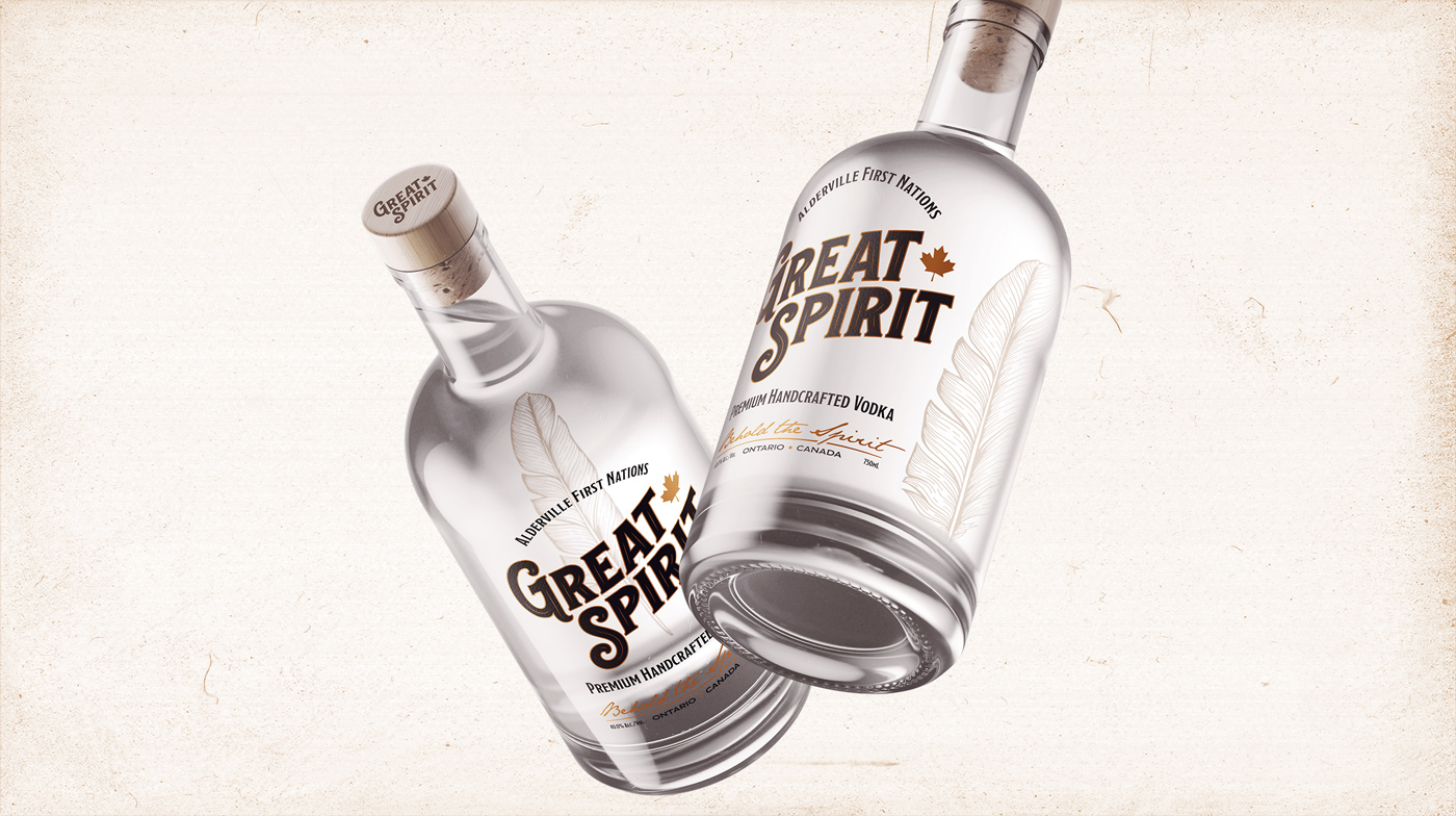
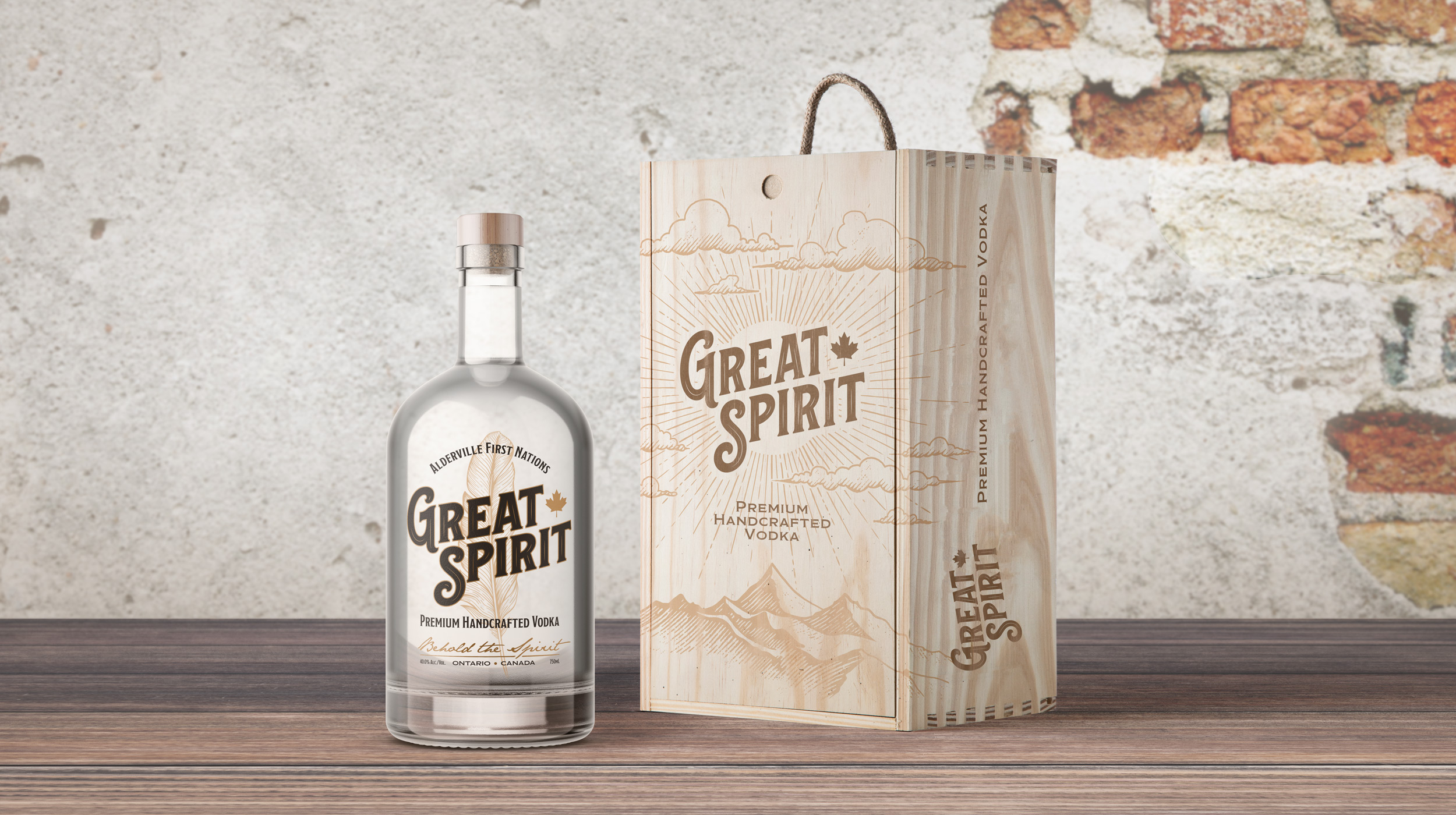
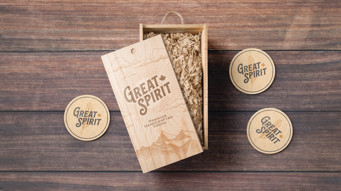
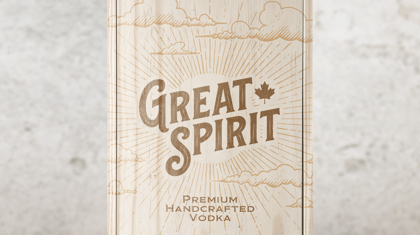
I got to work brainstorming and drafting concepts, and soon found myself exploring the world of 18th and 19th century spirits. I was heavily inspired by the hand made typography of the era, something akin to what you’d expect in an old western saloon. I felt like this direction would yield the results we were looking for. After some exploration and several iterations, I landed on a custom solution comprised of a pin-striped, offset logotype which rises to meet an unmistakable Canadian maple leaf. It was classy, inviting, “cool” — we had found our winner.
Upon approval, it was time to delve into materials. Specifically glass bottles. The manufacturer had supplied a collection of possibilities and we scoured them looking for ‘the one’. After some deliberation over squared vs. rounded, frosted vs. clear and explored different methods of labeling, we landed on a rounded classic gin-style bottle with a wooden corked cap. It was exactly what we needed and really helped set the tone that we had crafted for the brand thus far.

